After a few years of developing software together, our team felt that calling ourselves 'Algebros' didn't really cut it anymore.
Algebros was a playful name and stuck in people's minds quickly, but it started to feel rather unprofessional and out of focus. We therefor decided that a rebranding was in order.
We had a few brainstorming sessions and finally decided to try our luck with the name ifloop, mainly because it's short, easy to remember, and displaying our focus on programming while at the same time being kind of a joke (an if construct is not a loop).
I was then given the task to design a logo for our new brand, and it took me quite a bit of time and more than a dozen approaches until we finally had a logo our whole team felt comfortable with.
Getting started
Right after settling on the new brand name, I decided to take my task of designing a logo to the obvious route:
The brand name features the characters I,F, and a loop.
Combining the two characters via some sort of loop was therefor rather obvious, and it gave me numerous possible approaches: lowercase or uppercase letters, monospaced or proportional typefaces, a ton of ways to connect the letters depending on the typeface and the anatomy of the characters.
After quick and dirty drafts on paper I basically found around one dozen ideas that i felt were interesting enough to put more work into, ranging from very simple solutions to more complex geometric attempts.
Most of the early attempts were not without its issues: The first two attempts - for example - depicted above both felt a little off-message. Others were really good but just lacked a certain "extra", like the one below.
However, my annoyance with the character's arms also gave me a new idea: If i somehow managed to connect the arm of the letter F with the tittle (= the 'dot' of a character) of i, I'd have solved the imbalance problem and created a loop at the same time - an if loop.
Good idea, hard to accomplish.
The tricky part about that idea was that the arms of F extended to the right, but the letter I wanted to connect it to was to its left.
I tried numerous ways of solving that problem: Horizontally mirroring the F, creating more complex geometric structures to form a loop with multiple instances of IF, and more. None of it really worked.
After a few days of poor attempts I decided to try out some isometric attempts.
I developed the idea that by moving the character I to the front and moving the F to the back of my isometric perspective, I might be able to actually move the F to the left of the I and still have the focus be on the I first.
This idea became the base of the logo that eventually got picked.
Tuning, tuning, tuning
First, I decided to connect the bottom of the I with the bottom of the F via a soft curve (see left logo) and have the i tittle act as the top arm of the letter f, which looked convincing but failed when displayed in a small manner, because the bottom curve wasn't big enough compared to the rest of the logo. In a low resolution, the curve was basically invisible and just looked weird.
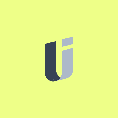
However, the idea felt right and so i gave it a try with straight lines. This looked better on small displays, but the F characters could easily be mistaken for being the shadow of the letter i, and - to make matters worse - an incorrect shadow at that.

So I decided to cut the tie between the letters by extending the line of separation between the two character stems, and to imply the connection via a perspective trick (compare the second and third depiction). This made the logo feel flat when just glancing at it, but the isometric angles give it a certain sense of three-dimensionality. It also guides the viewer to look at the I first since the perspective makes it feel in the foreground.

My hope as designer is that people will be able to see the allusion of the F, depicted by the stem on the left and the 'arm', the tittle. If you can't see it, you can also find a hint of an F in the negative space of the Logo
However, I'm still interested in feedback, whether it's negative or positive. Does the logo work? Does it not? Do you have an idea to make it better. Just drop us an E-Mail and we'll do our best!